Mission Bay Shuttle Redesign Shuttle UX
Human centered redesign of a time-critical commuting experience for easier, faster day
Role
Interaction Design, UX Research, Interface Design
Team
3 Interaction Designers
The Mission Bay Shuttle project is a human-centered interaction redesign of a real shuttle service in San Francisco. The project focuses on reducing commuter anxiety and cognitive load by improving how users access, interpret, and act on transit information in time-sensitive contexts.
Platform
Mobile App
Timeline
5 weeks

Daily commuters rely on shuttle services under tight time constraints, often while walking, multitasking, or already under stress. Existing shuttle experiences frequently fail in these moments.
Research revealed recurring pain points:
-
Unclear arrival times and route status
-
Information overload during
time-critical moments -
Anxiety around missing shuttles
-
Poor visibility of real-time updates
Small breakdowns in clarity compound into daily frustration and loss of trust in the system.


How might we design a shuttle experience that minimizes cognitive load and supports fast, confident decision-making in motion?
The opportunity was to:
-
Prioritize clarity over completeness
-
Surface the right information at the right moment
-
Design for glanceable, one-handed use
-
Reduce uncertainty during transit transitions
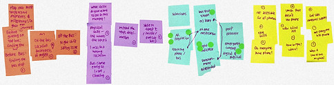


I conducted observational research, user interviews, and journey mapping focused on real commuting behaviors.
Key insights:
-
Users check transit apps in short,
repeated glances -
Accuracy matters more than visual richness
-
Users want confirmation rather than exploration
-
Stress increases when information hierarchy
is unclear
_edited_edited_edi.jpg)

Clarity First
Glanceability
Reduced Cognitive Load
Predictable Interaction Patterns
Trust Through Transparency

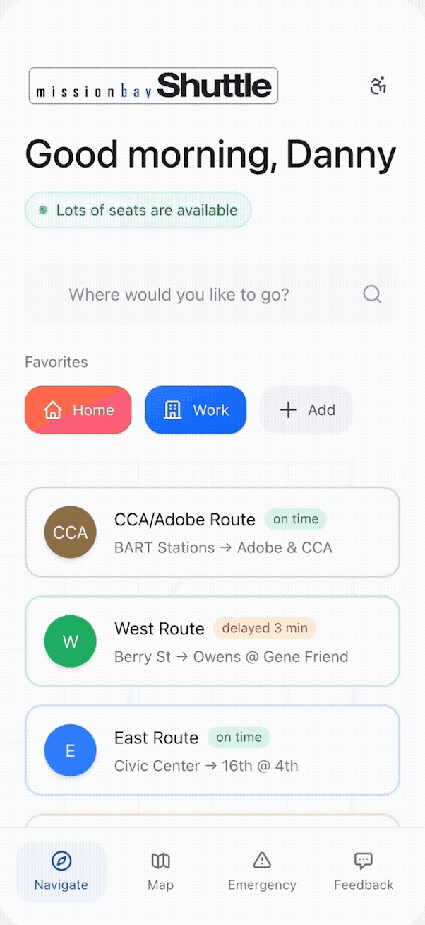
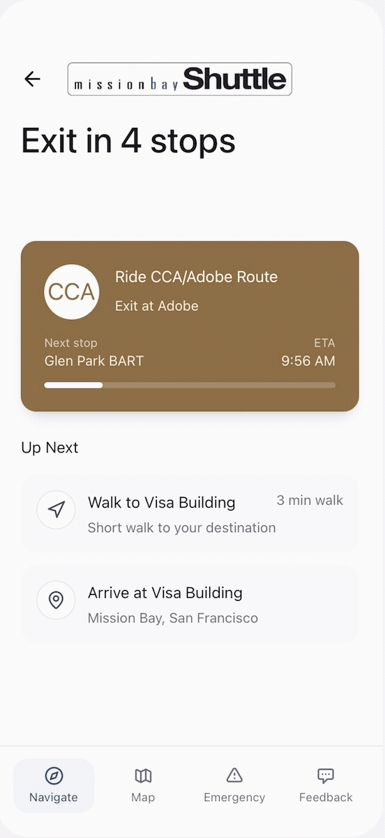
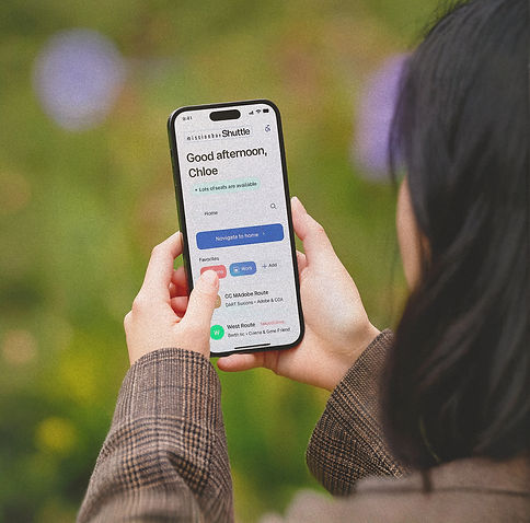
The home screen prioritizes live shuttle location, arrival time, and route direction. This allows users to confirm their commute status at a glance.
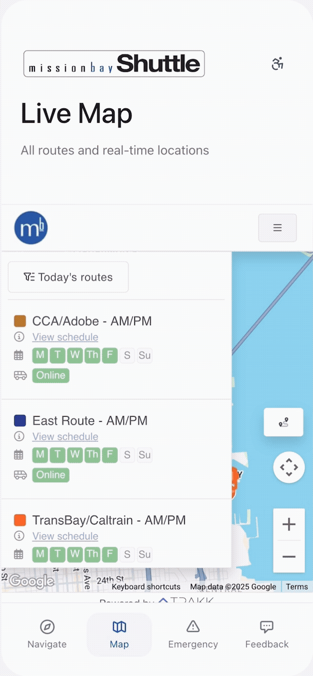


Routes are organized by user relevance rather than system structure. This reduces decision fatigue during commute planning.
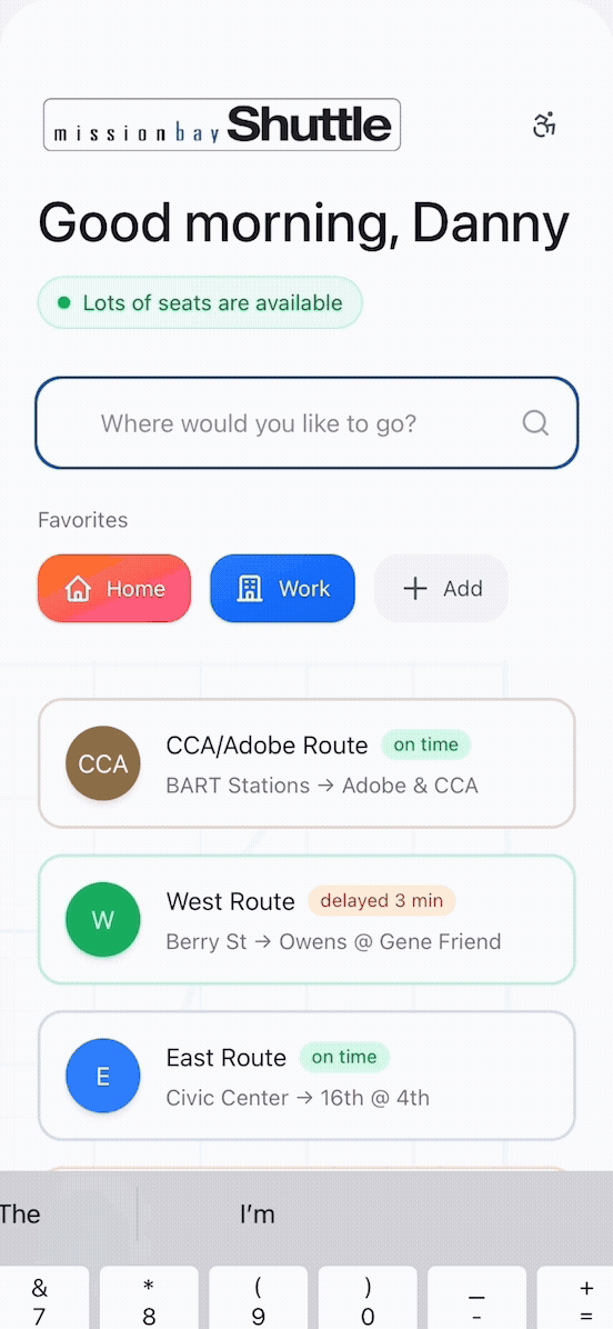


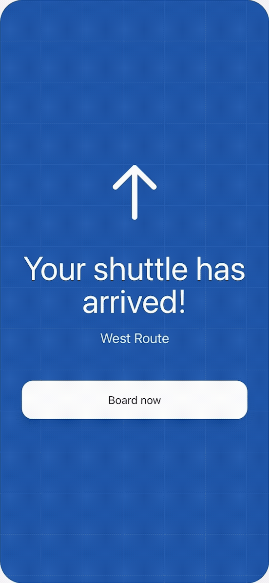
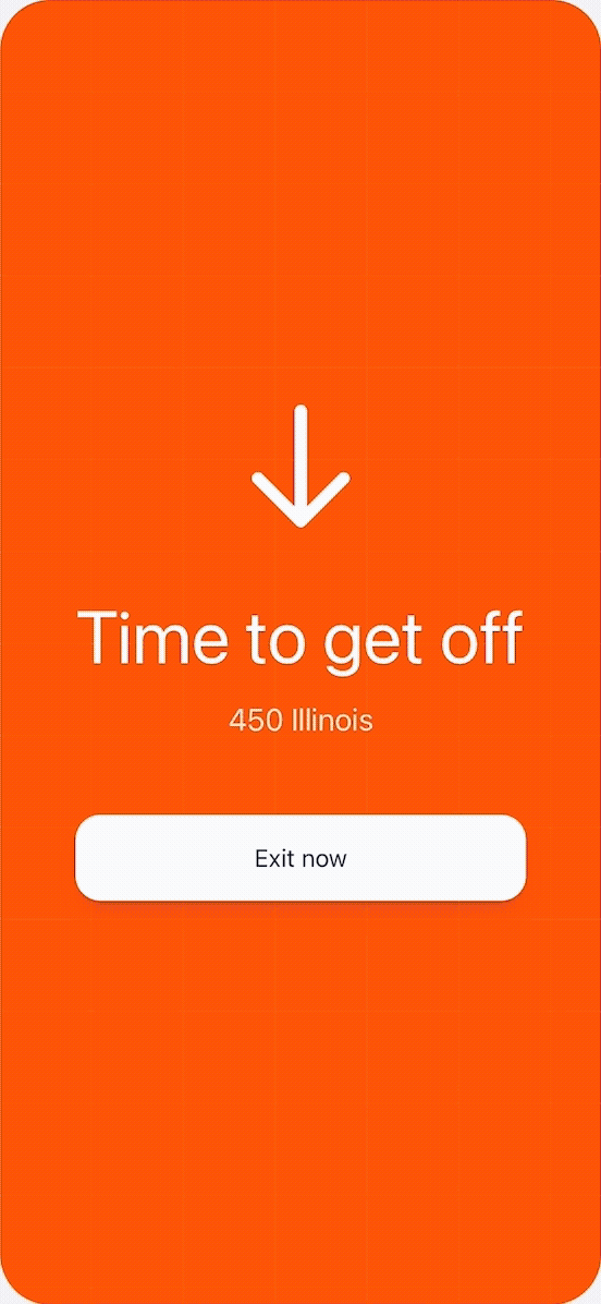
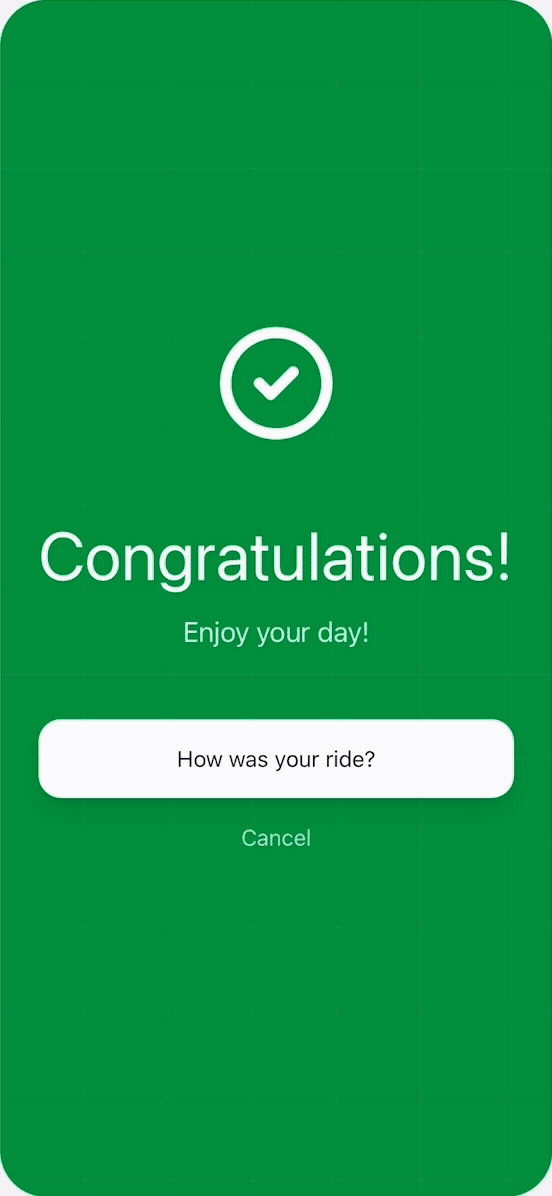
Missed shuttles, delays, and reroutes are communicated clearly to prevent confusion
and panic.

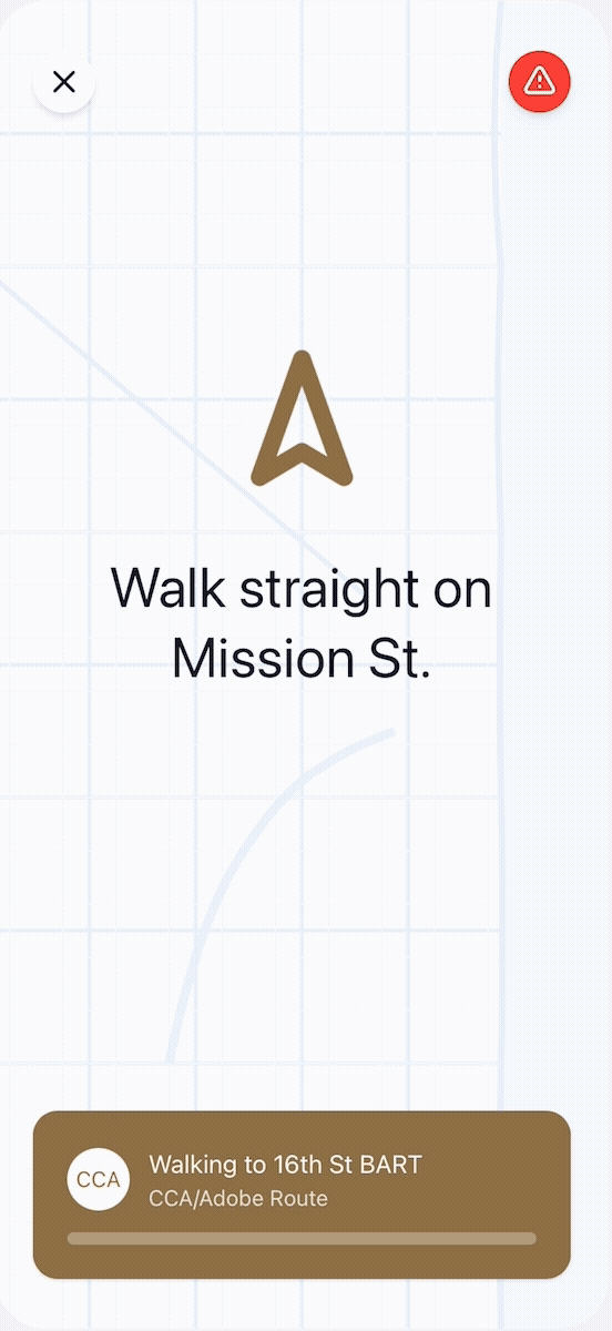
Information adapts based on where the user is in their commute, whether before departure, waiting, or in transit.

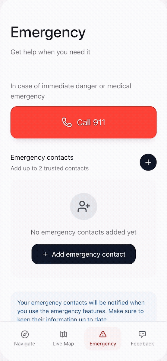
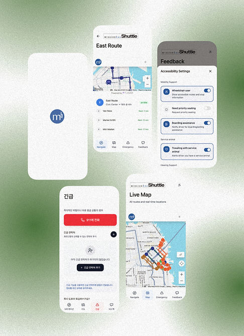
Accessibility was integrated from the start:
-
High-contrast typography for outdoor visibility
-
Large touch targets for one-handed use
-
Clear hierarchy for fast scanning
-
Consistent navigation across states
Design decisions followed WCAG-informed principles and mobile usability heuristics.


This project emphasized systems thinking and interaction clarity over visual novelty.
My focus included:
-
Designing flows for time-critical use
-
Defining interaction states and transitions
-
Reducing taps and decision points
-
Creating predictable and learnable patterns
Prototypes were iterated and tested to ensure usability under real-world constraints such as walking, limited attention, and inconsistent connectivity.


The final prototype delivers:
-
Faster access to critical shuttle information
-
Reduced commuter anxiety and uncertainty
-
A scalable interaction framework adaptable to other transit systems
The project demonstrates how thoughtful interaction design can meaningfully improve everyday urban experiences.
This project strengthened my ability to:
-
Design for real-world, high-pressure contexts
-
Translate research insights into actionable interaction decisions
-
Balance system complexity with user clarity
The Mission Bay Shuttle project reflects my approach as an interaction designer and product thinker. Clear, human-centered, and grounded in real use conditions.
